


Using the 2020 Color of the Year: Naval
-
Category
Innovation -
Posted By
Schmidt Associates -
Posted On
Jan 10, 2020

By Kaylyn Kelly, Interior Design Intern
As commercial interior designers, we typically don’t design around trends. Our goal is often to provide owners with colors and finishes that feel current but are generally timeless. We love a good statement, but we also want to prevent projects from looking dated in a few years and needing to be revamped. However, we’re loving the 2020 Sherwin Williams Color of the Year: Naval SW 6244.
Navy blue is a timeless color. It’s neutral, sophisticated, and versatile, yet it has drama and depth. It’s also grounded and inspired by nature. When utilizing this hue in a design, selecting neutral finishes and accompanying colors, as well as appropriate patterns, will ensure it endures for years to come.
We curated several different palettes featuring the Naval shade to demonstrate the nearly endless applications across a variety of types of spaces. Check out the palettes below to see the possibilities!
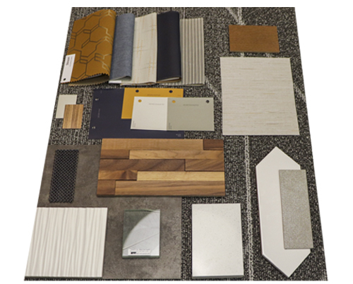
Palette 1: Office Environment
Corporate office design varies significantly based on the company’s operations, clientele, and the wants and needs of employees. Some corporate spaces are more traditional with closed-door offices and formal reception areas, while others prioritize flexibility and collaboration with a more home-like feel. Finishes often follow suite with the type of office.
We put together a versatile palette that could be applied to a variety of office spaces. We kept the base palette neutral and incorporated the Naval color in pops through paint and upholstery. Wood, concrete, and earth tone accents help to warm up the palette and create a professional yet contemporary feel with a subtle nature motif.
Form and function are important in office spaces, which are public spaces with high use. Finishes were chosen with this in mind, including the luxury vinyl tile (LVT) concrete-esque flooring, which is a cost-effective material with a high-end look.
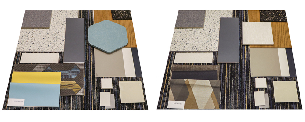
Palettes 2 and 3: K-12 Schools
When designing an educational facility, longevity is key. In these finish palettes, we incorporated neutral base colors alongside Naval to enhance its richness, while keeping the design visually classic for long-term appeal.
The first palette is geared toward an elementary school environment. We added pops of brighter colors, which have been shown to positively affect a child’s mood. In the second palette, intended for a high school environment, we upped the level of sophistication with more mature textiles and warmer tones to encourage focus.
Durability of permanent surfaces, such as flooring and tile work, is also critical in schools and played a big part in the types of materials we chose. Those long-lasting finishes are a great place to incorporate this classic navy color. We chose versions with a textured or speckled appearance to help hide dirt and grime.
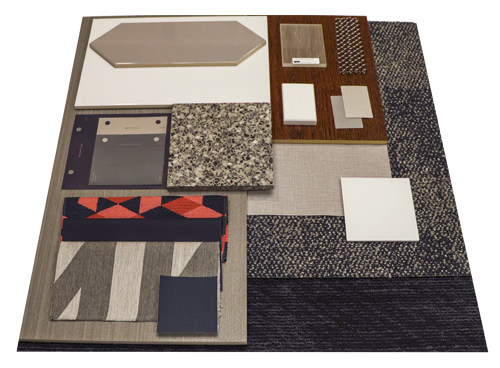
Palette 4: Higher Education Space
As with a K-12 school, longevity is an important consideration for higher education facilities. In a university setting, however, we look for more polished, sophisticated finishes that align with the level of learning occurring in the spaces.
In this palette, we offset the dark Naval hue with light accents to create balance and a fresh feeling. Chain drapery as a room divider adds a modern flare, and a pop of red textile breaks up the color scheme and adds a bit of personality. Upholstery is a great place to introduce more modern and unique patterns and colors like this one since they are more cost-effective to replace than finishes like flooring or cabinetry. A material like terrazzo is a great flooring choice for university buildings because it withstands the test of time not only in appearance but in durability.
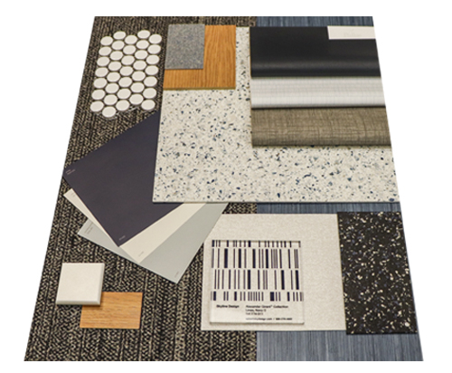
Palette 5: Community Space
At Schmidt Associates, we design a lot of community-centered spaces. This could be anything from a YMCA to a community tech center. These spaces often require finishes that are appropriate for a variety of uses and activities.
For this palette, we chose a collection of complementary blue shades and light neutrals to create an overall sense of tranquility. The upholstery selections consist of a combination of vinyl and synthetic fabrics for easy maintenance and durability, which are appropriate for multi-use spaces.
We also included a glass panel with a linear pattern that picks up the Navel color. Not only does this accent add visual interest, but it also ensures a clear sightline through the space and can act as a form of wayfinding.
Share this post on